Apadmi Brand Refresh: The Story Behind Our New Identity
Mellissa Flowerdew-Clarke, Apadmi’s Global CMO, explains the thinking behind Apadmi’s refreshed brand.
Apadmi has changed a lot over the years. What started as a mobile specialist has grown into a global digital product consultancy, with teams across Europe and Asia and partnerships with brands including Domino’s, Co-op, the NHS, Carlsberg, Footasylum and De Telegraaf.
Our new brand reflects that journey.
Today, we’re launching a refreshed identity and new website that better represents the business we’ve become — a team combining strategy, design, engineering, data and optimisation to create digital products that help ambitious brands grow.

A brand that matches our progress
Every day, we help organisations solve complex problems through exceptional digital products. It was only right that our own brand reflected the same level of thinking, care and craftsmanship that our clients experience when they work with us.
Our reputation has been built on creating products people genuinely want to use—combining strategy, design, engineering and optimisation to deliver measurable business outcomes. Our brand should communicate that from the very first interaction.
Whether someone visits our website, reads a case study, receives a proposal or discovers us on social media, every touchpoint should reinforce the same message: we’re a trusted partner that delivers high-quality work with clarity, confidence and attention to detail.
The refresh also gave us the opportunity to sharpen how we communicate what Apadmi does. Our new website better represents the breadth of our expertise, making it easier to understand how we help organisations unlock growth through mobile. From increasing customer loyalty and modernising operations to empowering healthcare professionals and launching new digital services, we build products that deliver lasting business impact.
Most importantly, we’ve brought everything together under one cohesive identity. Strategy, design, engineering, AI innovation and optimisation are now presented as one connected offer, creating a clearer, more consistent experience wherever people encounter Apadmi.
simplicity and strength
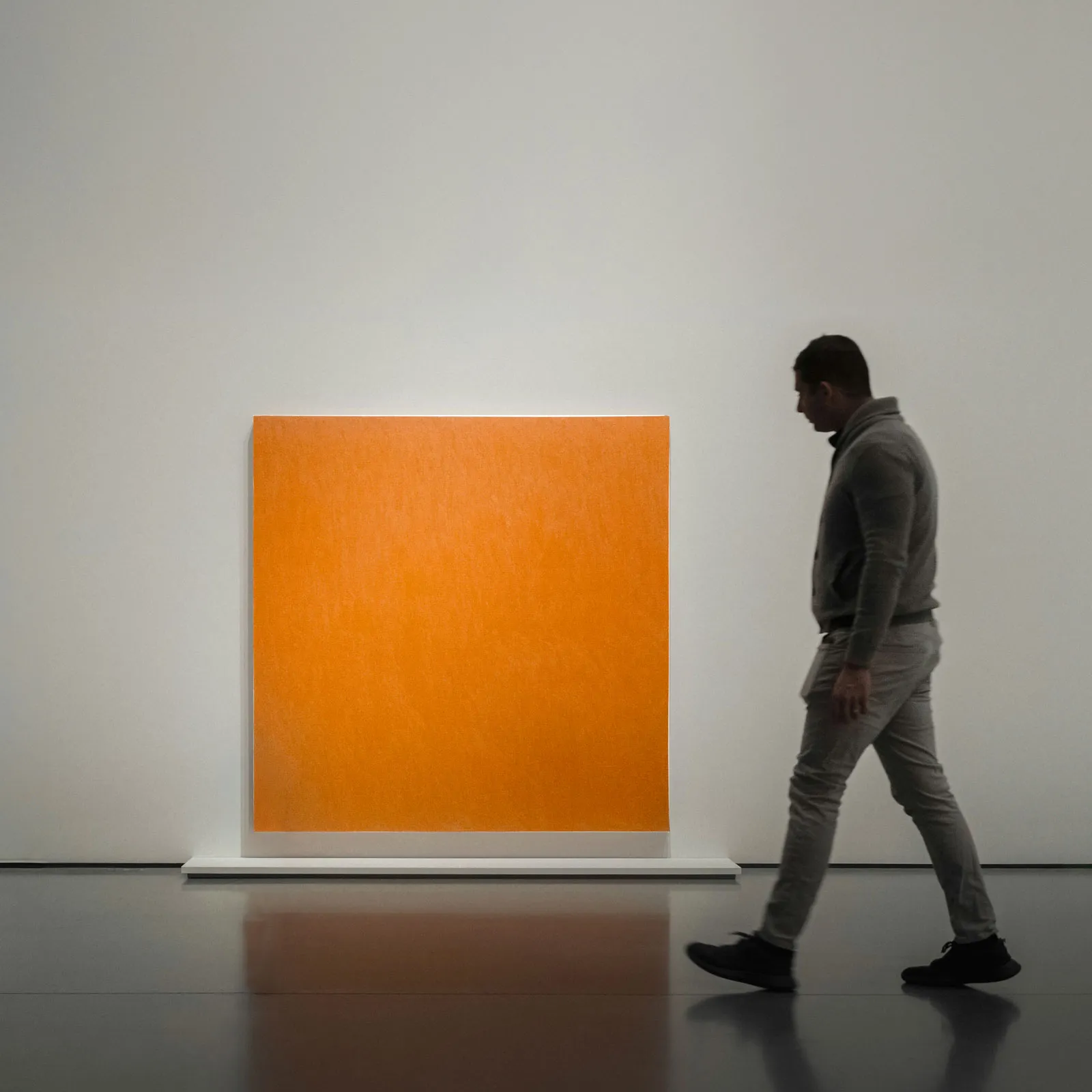
The square represents the qualities that have always shaped Apadmi—clarity, precision and reliability. It reflects our engineering heritage and the structured thinking behind every digital product we create.
At the same time, it’s designed to evolve. Squares can be arranged, expanded and reimagined into something greater, reflecting the way our teams collaborate, our technology adapts and our ideas come together to solve complex challenges.







Powered by energy and creativity
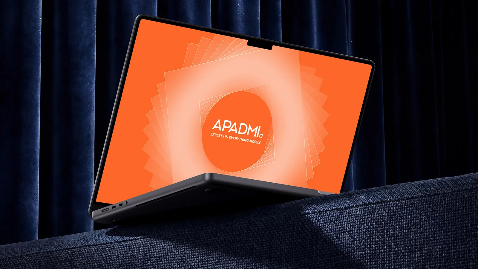
If the square represents our foundations, orange captures our spirit. It’s bold, confident and instantly recognisable as Apadmi.
As our heritage colour, orange reflects the energy that drives our business forward. It represents the curiosity to explore new ideas, the creativity to solve difficult problems and the ambition to build digital products that make a real impact. Most of all, it celebrates the people behind Apadmi; the teams whose expertise, collaboration and passion shape experiences used by millions every day.
One Apadmi
This launch also marks an important moment for our teams in the Netherlands, as PINCH officially becomes Apadmi.
Bringing our brands together creates one clear identity across our global team, while keeping the expertise and relationships that have made both businesses successful.
A new brand doesn’t change what we do. It helps people understand it better.
We’re still the same people building the same thing: digital products that solve real problems, create better experiences and deliver measurable impact.
This is the new Apadmi, and we’re only getting started.
Let’s build what’s next
We work with ambitious organisations to design, build, and scale digital products that solve real problems, improve customer experiences, and deliver measurable impact.