Apadmi Brand Refresh: The Story Behind Our New Identity
Mellissa Flowerdew-Clarke, Apadmi’s Global CMO, explains the thinking behind Apadmi’s refreshed brand.
It’s a new chapter for Apadmi. We’ve refreshed our brand and launched a new website to better reflect who we are today: a global mobile consultancy helping ambitious brands unlock growth through exceptional digital products.
But this isn’t a change for change’s sake. Over the last few years, Apadmi has grown significantly. We’ve expanded our teams into new markets, strengthened our capabilities and built long-term partnerships with some of the world’s best-known brands. From our Manchester roots, we’ve expanded into a global team of 500+ experts across the UK, the Netherlands, Poland, and Sri Lanka.
Our old identity served us well, but as Apadmi evolves, we need a brand that reflects where we are now and where we’re heading next.

More than a visual refresh
We spend every day helping our clients create digital products that are intuitive, thoughtful and well-crafted. The experience of our brand needed to match the experience of working with us.
Our clients know us for solving complex challenges, building products that people love to use and delivering work that creates measurable business impact. Every interaction should reflect that same level of quality, clarity and attention to detail.
From our website and case studies to our socials and proposals, every touchpoint should give people the same confidence they have when they work with our team. That’s what this refresh is about: creating a brand experience that reflects the expertise, ambition and care that goes into everything we do.
Alongside the new identity, we’ve reshaped how we talk about what we do. Apadmi has the specialist skills and knowledge to make mobile a differentiator in any business. Our new website showcases the full breadth of Apadmi’s expertise and the outcomes we help our clients achieve. Whether it’s helping retailers build customer loyalty, supporting healthcare professionals with better digital tools, streamlining operations or launching new digital services that drive revenue, we focus on creating digital products that make a measurable difference.
This refresh has brought everything together. Our strategy, design, mobile engineering, and AI innovation expertise now sit under one clearer, more consistent identity.
The heart of our brand is square
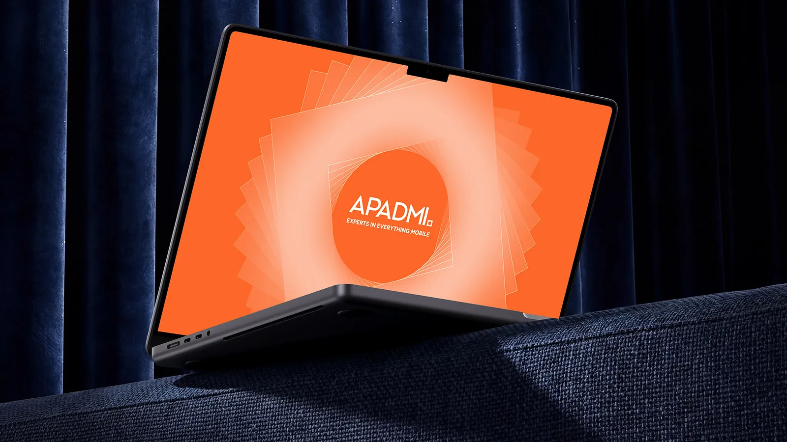
The square, a key part of our logo, is a small shape with a big role to play. It represents the foundations that have always defined Apadmi: structure, reliability and precision. It reflects the engineering mindset that sits at the core of everything we build.
But it’s also flexible. Squares can be combined, connected and transformed. Just like our teams, our technology and the products we create.








The energy of our brand is orange
If the square represents our foundations, orange represents our energy. It’s bold, optimistic and unmistakably Apadmi.
Our heritage brand colour, it captures the curiosity, creativity and momentum that runs through Apadmi. It reflects the people behind our work; the teams who challenge assumptions, solve problems and turn ideas into experiences used by millions of people.
One brand, one team
This launch also marks an important milestone for our colleagues in the Netherlands. PINCH officially becomes Apadmi, bringing our teams together under one brand.
It’s the next step in our journey as a global team, combining our shared expertise, experience and passion for building exceptional digital products.
While our identity is changing, what matters most stays the same: the people, the partnerships, and our commitment to creating mobile experiences that make a difference.
We’re excited for this next chapter and everything we’ll build together.

Let’s build what’s next
We work with ambitious organisations to design, build, and scale digital products that solve real problems, improve customer experiences, and deliver measurable impact.