


How mobile-first strategies are reshaping digital experiences
by Apadmi|Thu Jun 26 2025

Mobile-first strategies are changing the way businesses approach their digital products. As mobile devices have become the primary platform for accessing content, companies must rethink their design and user experience to keep up with this shift.
By placing mobile at the centre of digital development, businesses can ensure that mobile users receive the best possible experience. As mobile usage continues to outpace desktop, you need to prioritise this shift if you want to stay ahead. Whether you're an app developer or a business owner, understanding these strategies will help you remain competitive in an increasingly mobile-driven world.
What is a mobile-first strategy?
A mobile-first strategy is all about designing and developing for mobile users before considering other platforms like desktop. The idea is to optimise for mobile from the very beginning, ensuring the user experience is seamless on mobile screens.
With 80% of online shopping visits, and 70% of online orders, now via mobile in the UK - prioritising mobile makes sense for businesses. Putting these users first can create streamlined experiences that meet their needs and expectations, which often differ compared to desktop users. This approach focuses on speed, usability, and performance, which are crucial for engaging users on mobile devices.
This strategy challenges the traditional method of designing for desktop first, which often results in a poor experience when scaled down for mobile. Instead, mobile-first design ensures that the mobile version is the focal point, and other platforms follow this foundation.
Mobile-first vs. responsive design
Understanding the difference between mobile-first design and responsive design is key for those aiming to deliver seamless experiences across devices. While both approaches ensure that a site or app looks good on all screen sizes, they follow different processes.
Mobile-first design
With mobile-first design, the process starts by creating an optimised experience for mobile devices. Once the mobile version is fine-tuned, the design is expanded to accommodate larger screens like tablets and desktops. This method puts mobile users at the centre, making sure they have a smooth and fast experience before worrying about other platforms.
Responsive design
Responsive design, in contrast, involves creating a flexible layout that adjusts to different screen sizes. While this is effective at ensuring your site looks good on all devices, it doesn’t prioritise mobile users. Responsive design works from a single design that adapts, rather than building from the ground up with mobile as the starting point.
How mobile-first strategies impact user behaviour
The shift to mobile-first strategies not only affect how digital products look, it significantly influences how users behave. The goal is to create an optimal experience for users, which in turn affects their interactions with digital products.
Improved usability
When digital products are designed for mobile-first, they tend to be more intuitive. The design forces companies to strip away unnecessary elements and focus on the essentials, creating a simpler, easier-to-navigate experience. This simplicity can reduce user frustration, making it easier for users to find what they need quickly.
Faster load times
Mobile-first prioritises speed, ensuring that pages load quickly on mobile networks, which can often be slower than desktop internet connections. Quick loading times are crucial for user retention, as slow sites are a turn-off for users, especially on mobile where expectations are high.
Higher conversion rates
Mobile-first design improves the overall user experience, which in turn leads to higher conversion rates. Whether it’s making a purchase, signing up for an account, or subscribing to a service, it’s easier for users to complete their goals, resulting in more conversions. A seamless, fast experience means users are more likely to engage and take action.
Real-world examples
Looking at how top brands have adopted mobile-first strategies can provide valuable insight into their success. Here are two examples of businesses that have embraced mobile-first design and seen remarkable results.
Domino’s Pizza
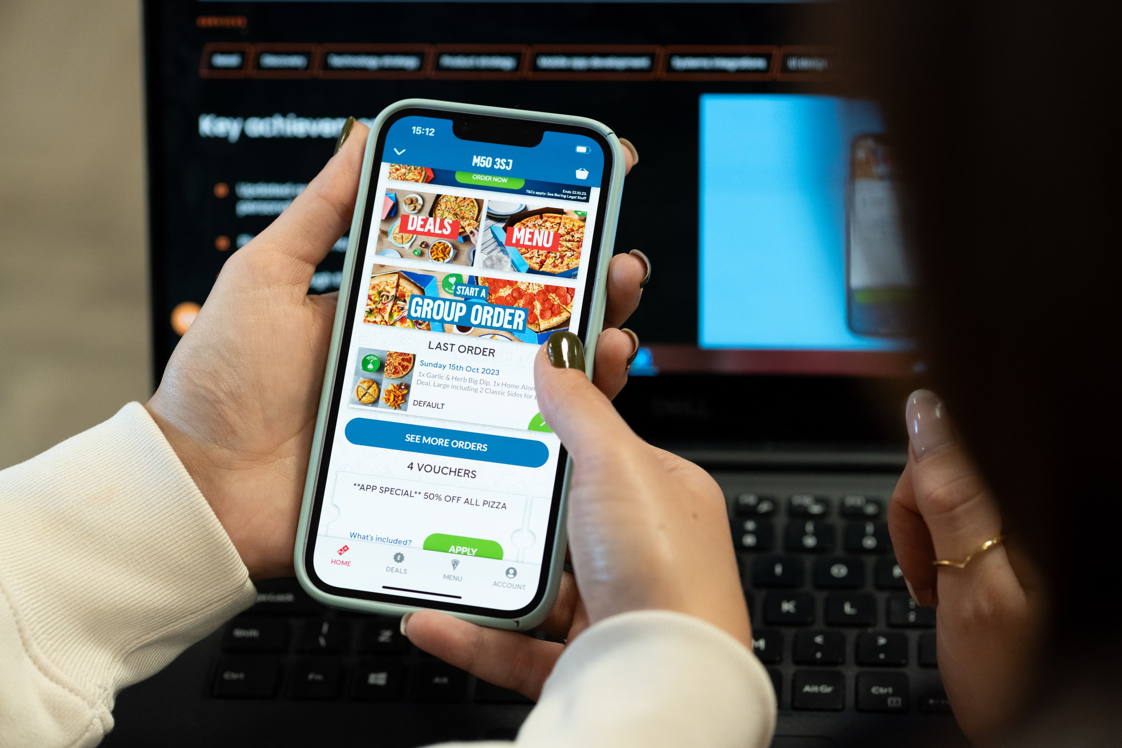
Domino’s adopted a mobile-first strategy to enhance its ordering process, making it easier for users to order pizza from their smartphones. By focusing on mobile, they streamlined the user experience and made ordering more intuitive, which led to increased engagement and higher sales. This allowed them to optimise for smaller screens and touch-based interaction, ensuring users could complete their order with minimal friction. Mobile is now there biggest channel, with almost 90% of orders coming through their app.
Argos Financial Services
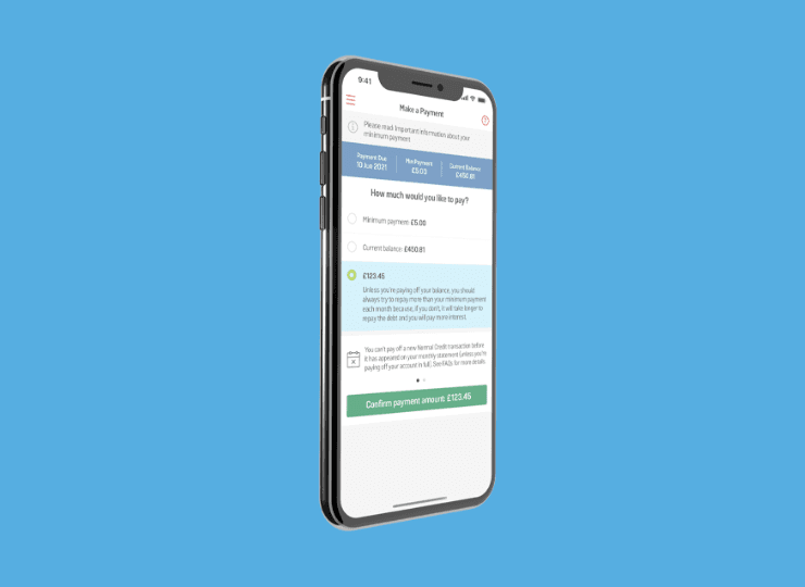
Our work with the Argos focused on creating an app that offered fast, easy access to customer accounts. Users can manage their accounts, make payments and adjust limits — all the while being rewarded for their loyalty. The app was an overnight success with 80% of store card customers using the app, with its simplicity and user-friendly design leading to a reduction in customer services calls, fraudulent activity and paperwork.
Maximising mobile with Apadmi
At Apadmi, we specialise in crafting solutions that meet the needs of users and provide tangible results. Get in touch with us today to find out how we can help you optimise your digital products for the mobile-first world, or learn more about our mobile app development process.
Share